Where is the bus?
Skills: Lead product design, Native iOS & Android, User research & testing, Design systems, Accessibility
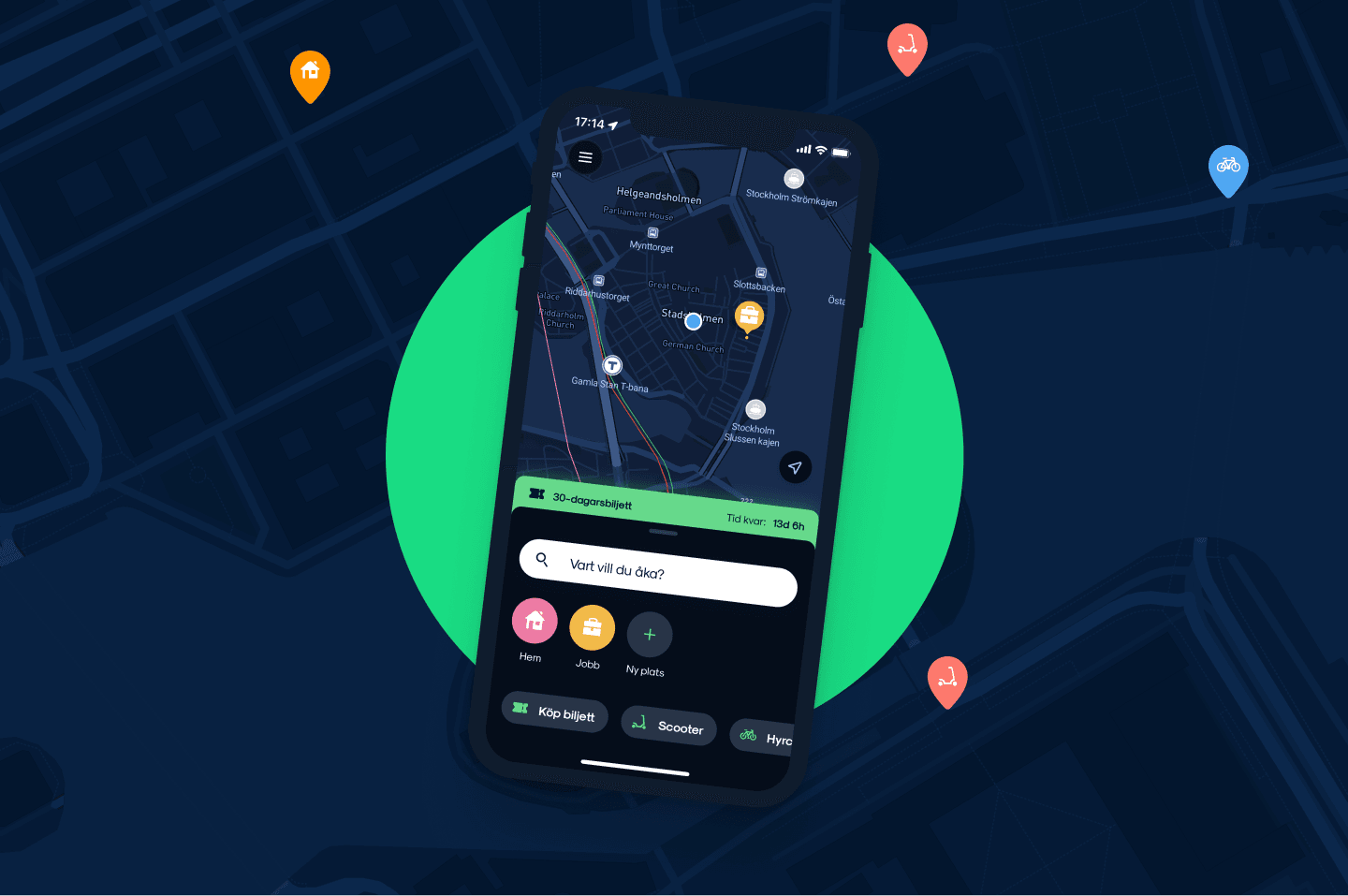
Problem: One of our most requested features in the app already existed, but no one was ever using it. It was rarely working as we intended and the design was instead confusing the users.
My role: Lead on the feature: research, design direction and priorities. Reported to the Product Manager.
Team: Me, one product designer, three developers and a QA tester.
Timeline: 3 months, native iOS and Android.
Result: Usage up 30% after launch, and a much better result when testing it against our users.
Context
Travis is Nobina’s travel app for public transport in Stockholm and Gothenburg, with the goal of becoming the number one transport app in Sweden. I was on the team for almost two years as lead product designer, reporting directly to the product owner. During my time there I set up user research, built the design system and design library from scratch, and shipped a lot of features together with my team. This case is a project for one of those features.
The problem
“Where is the bus?” was one of the most requested features in Travis, which already existed in the app before I joined. It was just well hidden and hard to navigate for users. Users who eventually found it were met with a confusing design paired with a, most of the times, broken implementation.
To get it to market fast it had been built straight off SL’s API with little or no design involvement. Considering the support tickets regarding it not working and that I identified this as a pontential revenue flow for ticket sales, we decided to get working on fixing it.
What we learned
First we needed to validate our suspicions and test different paths towards working prototypes. I ran interviews with travellers on the street and moderated tests with a recruited group who worked through prototypes and questionaires with eye-tracking and recording.
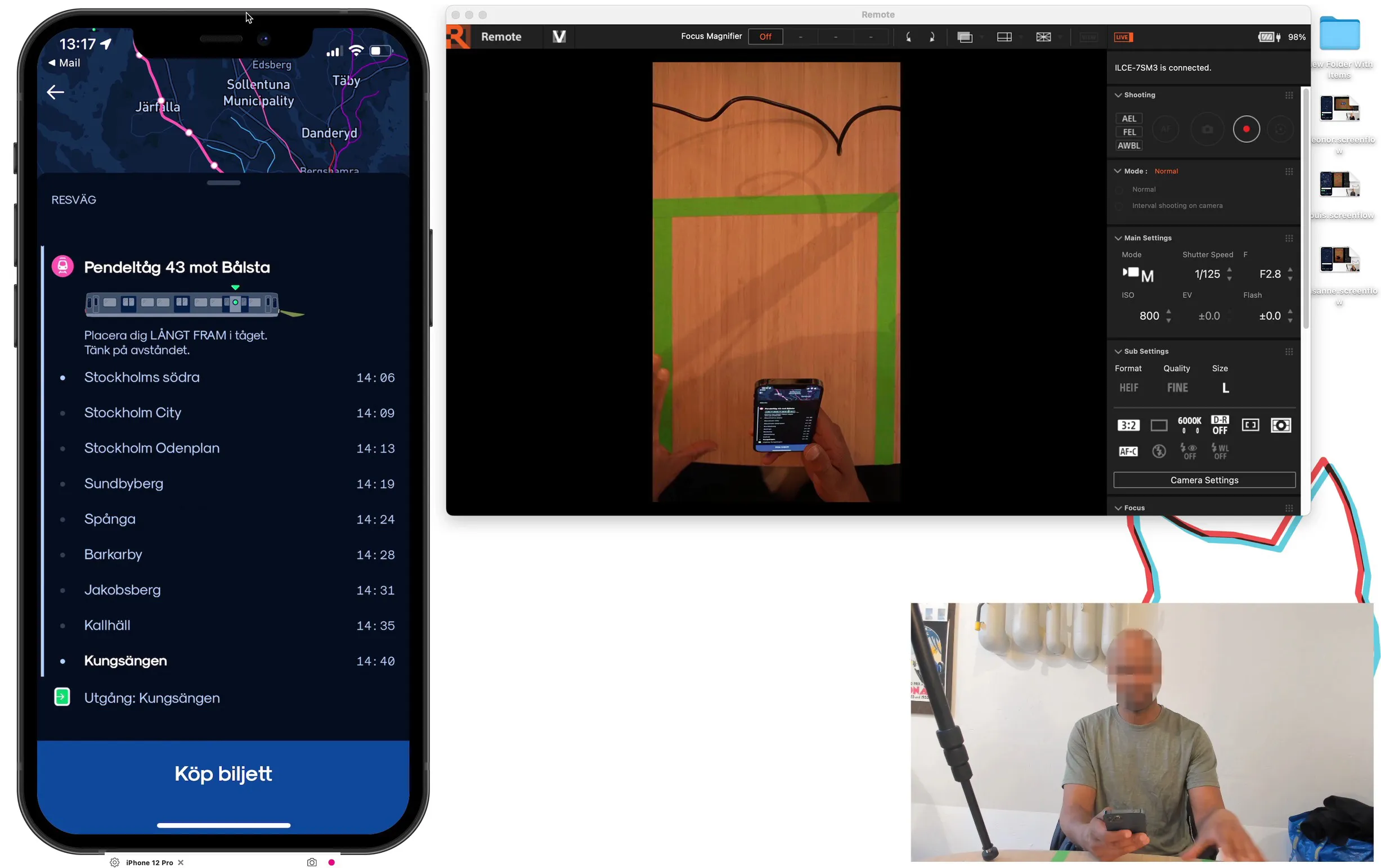
Two findings shaped what we did next. The app’s dark-only theme made the map icons hard to see, and buses and bus stops looked so alike that users couldn’t tell them apart. And as we suspected, the feature was hard to find, and once you were in it, there was nothing to do next. No call to action, and no route to a ticket.
The decisions I made
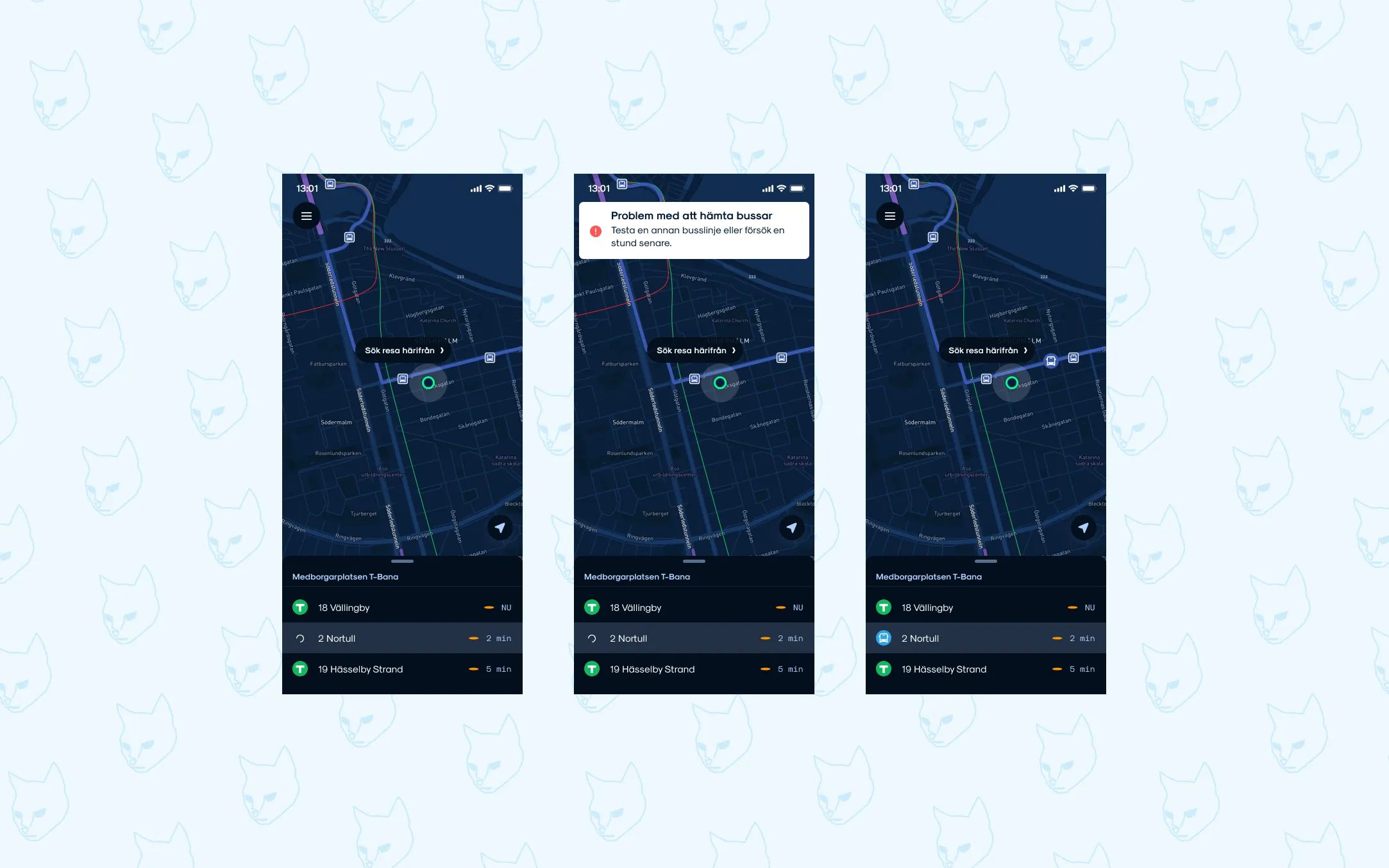
Rebuild, don’t patch. Fixing only the bugs wouldn’t help a feature nobody could find or use. I reworked the prototypes from the testing sessions and came up with iconography and colors that worked better and were more intuitive. Also the way we presented busses on the map as well as in the bottom sheet. At the same time the functionality was rebuilt on the backend to show the correct busses and positions.
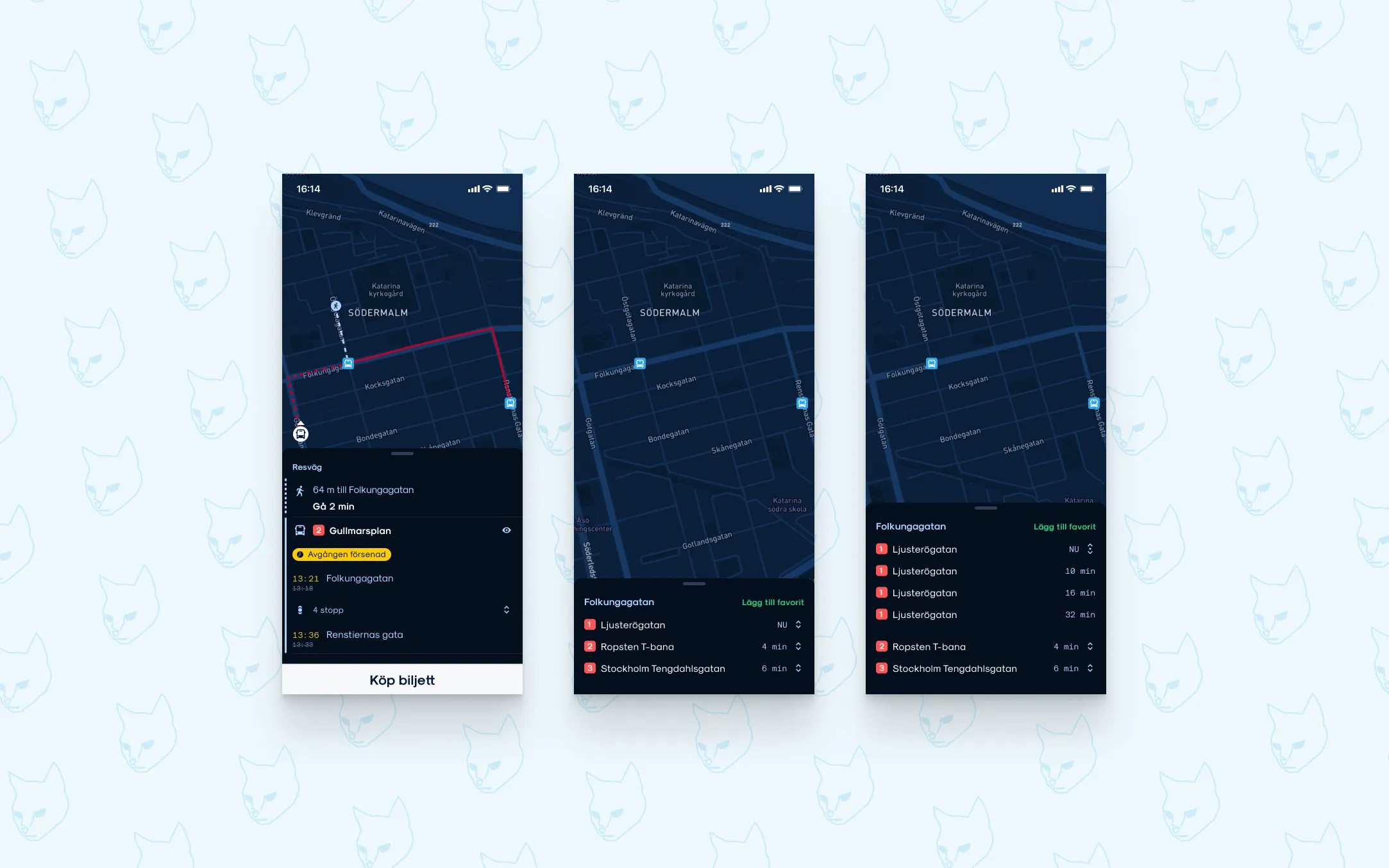
Use the platform’s own pattern. In the original version of the app we had a component which looked like a bottom sheet but didn’t work like one and was only cosmetical. This meant that when users tried to minimize it to see the map it didn’t work. Instead I decided it was a good component to continue working on but we needed the native component itself. On Android that meant a Bottom Sheet, and on iOS a Sheet. The same behaviour working like users know it.
Kill dark as the default theme. A travel app is used by everyone, often outside and on the move, so accessibility was a requirement. The lighter theme became the default. I reworked the icons and colours so buses and stops no longer looked alike, made the bus easier to spot and added an arrow showing which way it’s heading.
Solving the visibility and the call to action. Last part was putting the function inside of the logical travel flow, when users searched for a trip they would see it immidately in real time with different routes to choose from. Also adding the purchase ticket at the bottom so that you could track your bus and buy a ticket before getting on.
Solving the last pieces. Instead of hiding it, I built the feature into the travel flow. When you search for a trip, you see the buses in real time on the choosen route. At the bottom I placed the ticket purchase button, so you can track your bus and buy your ticket before it arrives.
Shipping it
We shipped the feature in three months while the team also worked on bug fixes and technical debt. I kept a design backlog running ahead of development, prioritised against both, so the developers always had something ready to build and the feature never stalled other work. Components came from the design system I was building alongside, so both platforms shared one language and still felt native.
Results
After release, usage of the feature went up by 30% as more people found it. When we tested the finished version with users, it performed much better than the old one. The lighter theme we validated here went on to become the default for the whole app.