Building a design system for Majority to bring people together
Skills: Design Systems, Figma, Design Tokens, Frontend
The Problem
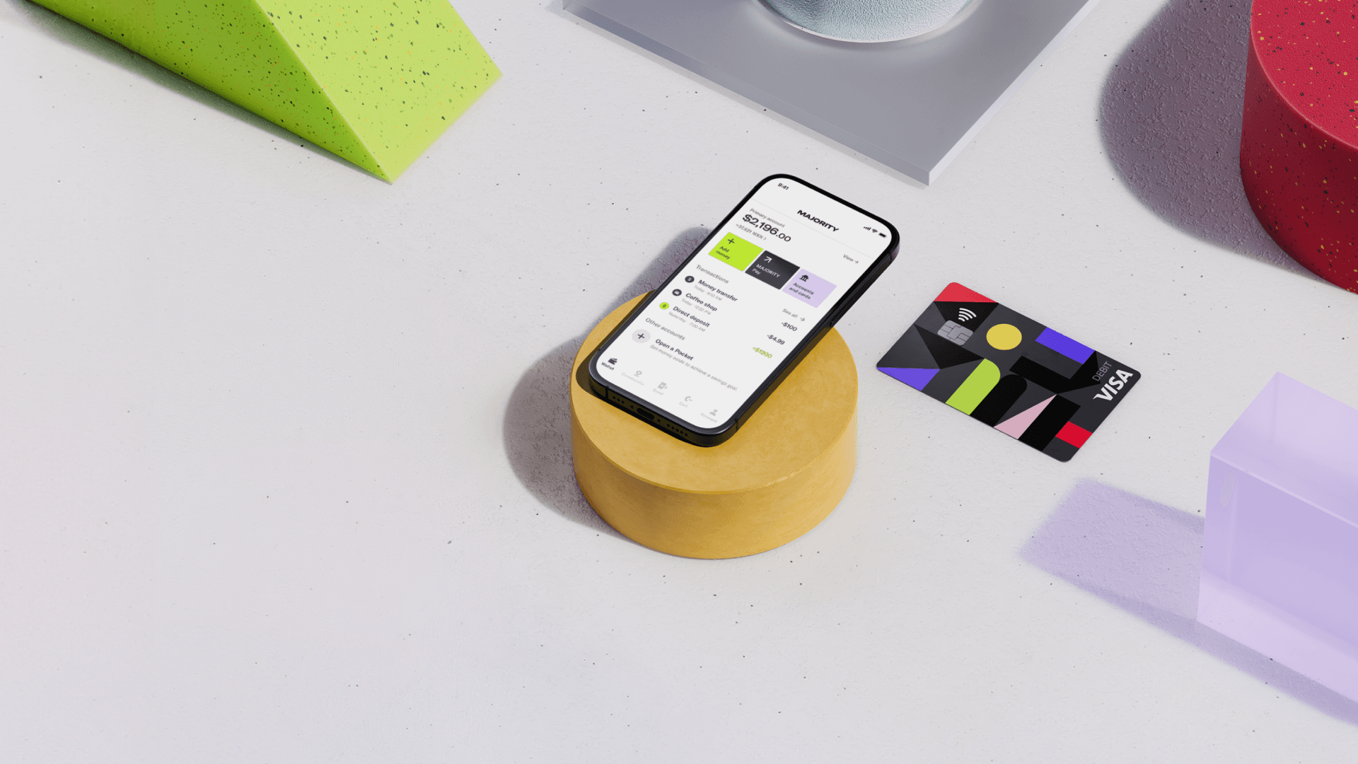
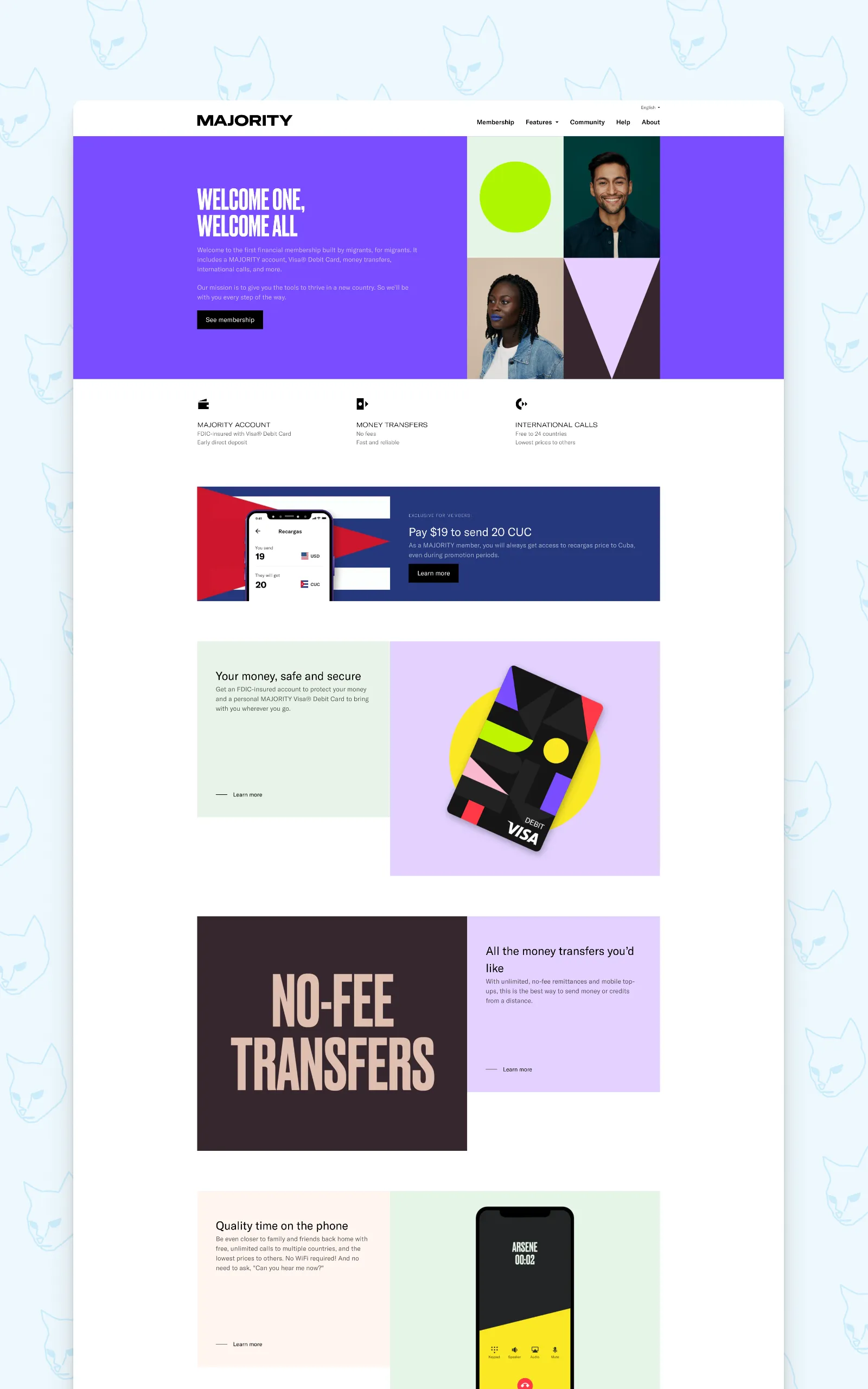
Majority is a mobile banking app built for internationals (mostly moving to the US) where they can open an account with just a passport, no traditional banking documentation needed. The app was their focus and the web had been left behind even though it was their main entry point for new customers.
When I joined in 2020, their web presence was a patchwork of different ideas and wills from design to development. Developers had built components their own way, designers were frustrated that nothing looked or behaved as intended, and there was no single source of truth for either side to refer to. The gap between what was designed and what was shipped was a constant source of friction.
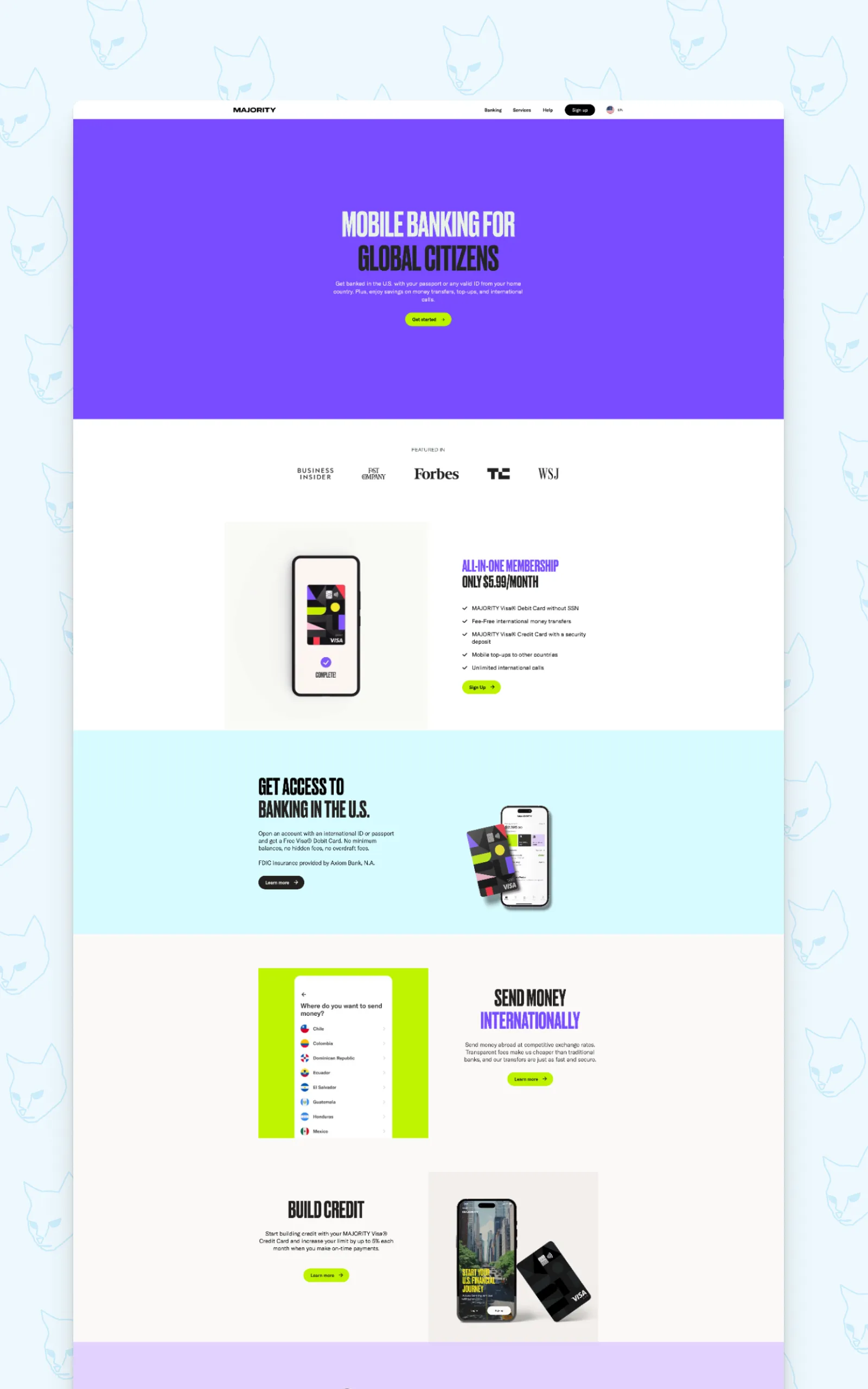
My initial brief was rather straightforward; to create a cohesive design for their web presence that followed the brand guidelines provided by a third party. For a few years we worked page by page, block by block. Then in 2024, Majority refreshed their branding and if I were to do it, it better be done the right way.
Starting with the nitty gritty, building up
The first thing I pitched was moving Majority’s entire web design workflow from Sketch to Figma. Not just for the tool itself but because of versioning and that Figma’s variable and library system would let us build something that designers and developers could genuinely share. Since the app team had already started moving in that direction I got the go ahead.
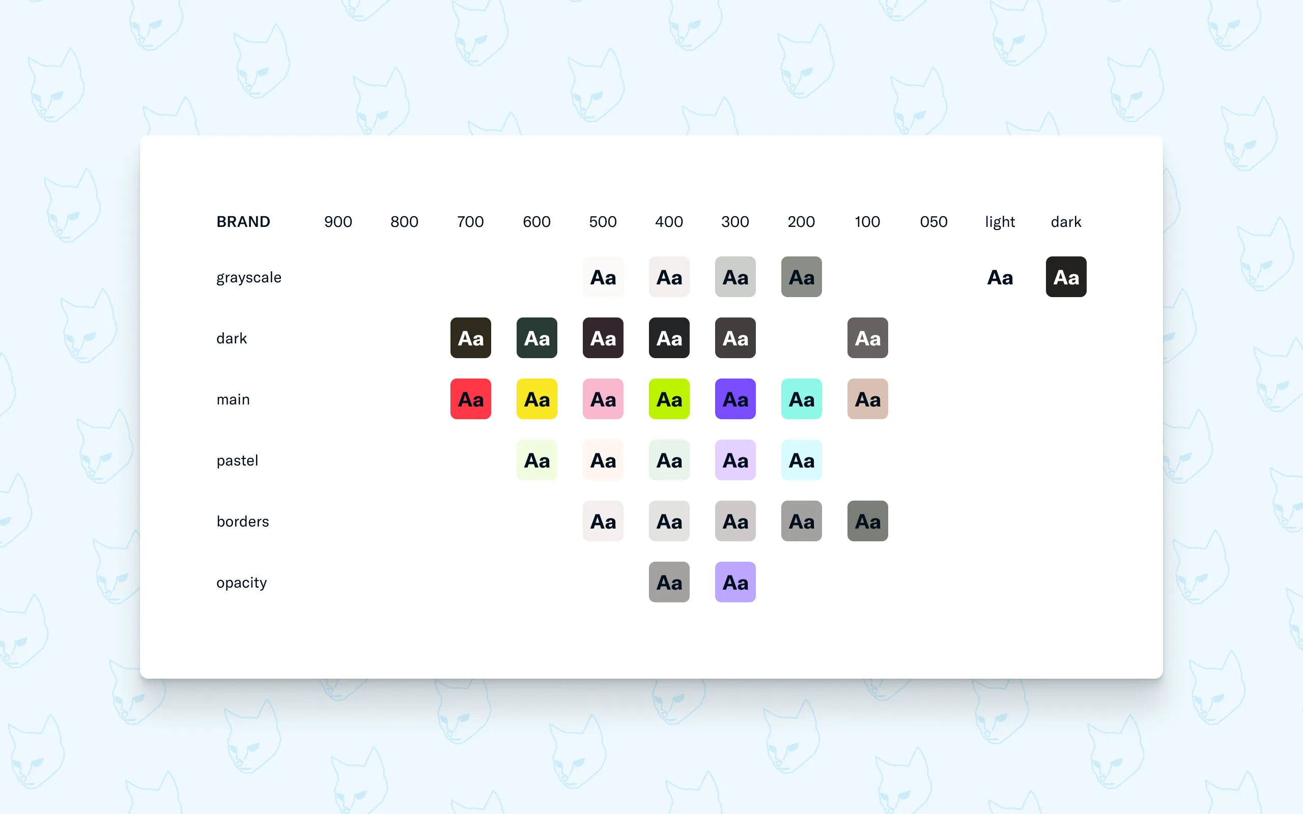
Starting from scratch, my first step was studying the new brand guidelines and auditing everything already in use on the web. Every color, typeface, spacing and sizing value and everything in between. From this I started with the Foundation document, containing all the primitives.
The key principle here was intentional vagueness. A primitive color called main-100 doesn’t tell you what it’s for and that’s the point. It’s a pattern, a building block, not the decisions. The decisions come later. This approach meant the foundation could stay stable and expandable even as the design evolved on top of it.
One document to rule them all (almost)
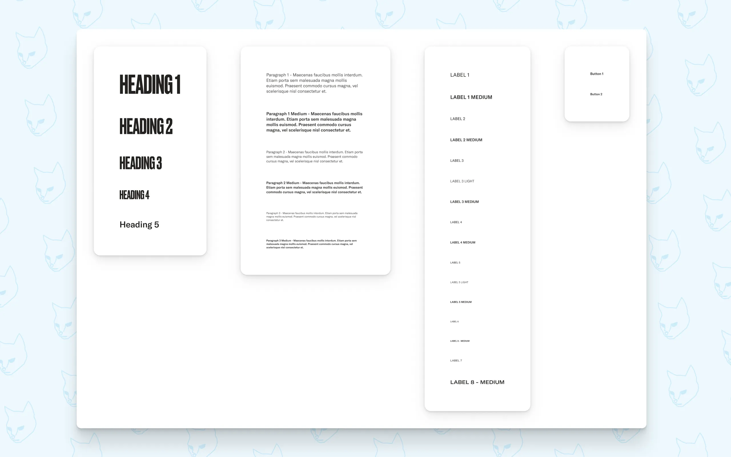
The second document I built was the Style Guide, which is the only document in the system that reads directly from the Foundation. Everything else, every component and every page, reads from the Style Guide. This single-source structure means a change made at foundation level flows through the entire system automatically. This will matter later on.
Inside the Style Guide I set up typography with headings, body text, labels and more as well as breakpoints, shadows and border radii properties among other important building blocks. Everything visualised but built programmatically. But the most important feature of the Style Guide was still to come.
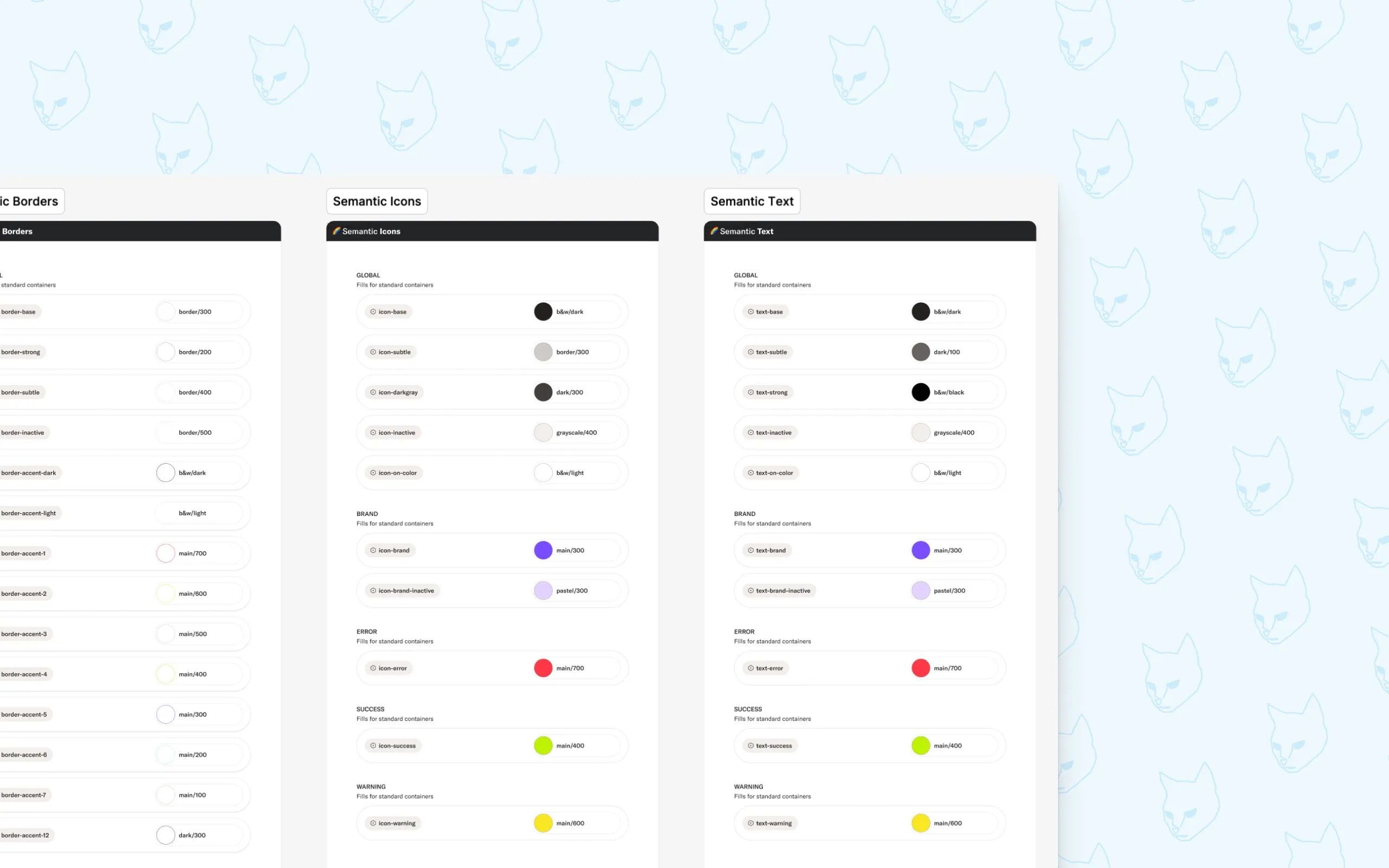
Semantic colors: giving every color a purpose
This is one of those things that for me creates that very important bridge between a developer and a designer. Raw color primitives tell you what a color could be. Semantic colors tell you what a color does.
I created four semantic categories: Backgrounds, Borders, Icons and Text. Every color used anywhere in the product maps to one of these. A primitive like dark-100 gets assigned a semantic name like text-base. From that point on, nobody needs to guess, the name tells you exactly where to use it.
“I have a body paragraph on a base background, I’ll use text-base. I have text sitting on a colored background, that’s text-on-color.”
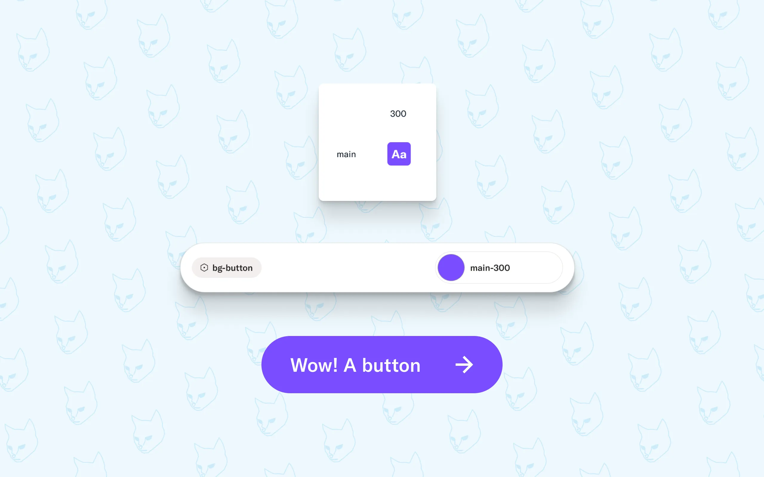
The real power however shows up when things change. If a designer decides the main button color needs updating (main-200 -> bg-button), they have options. They can either decide that main-200 need to change as a base color and change that foundational color which replaces main-200 and all instances using that to the new color. Or they might instead want to change which foundational color bg-button should map to. One variable and every button across the entire product updates instantly. No hunting through files, no missed instances, no inconsistencies shipping to production.
Presenting this kind of programmatic thinking visually, with clear structure and real examples, was the moment the whole team got on board. Designers felt empowered rather than constrained. Developers finally had a system that matched the way they think.
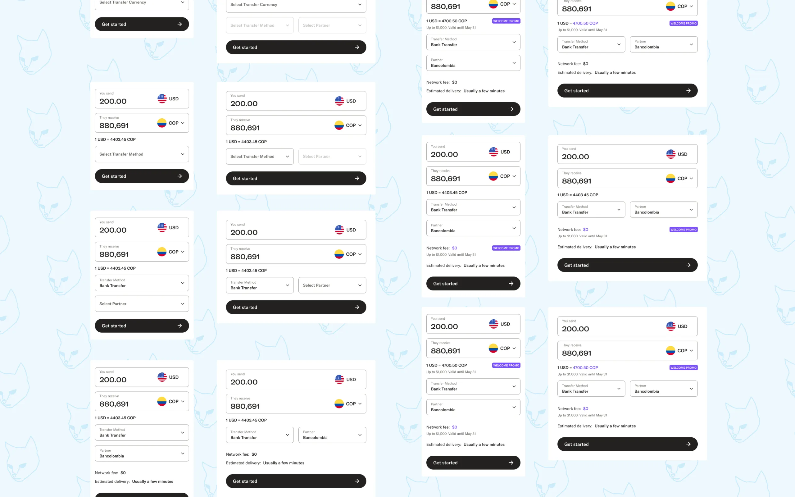
Components built on solid ground
With the Foundation and Style Guide in place, building the UI Kit was the most straightforward part of the process, which is exactly how it should be. The rules were already set. I could focus entirely on the craft: states, animations, component structure and the small details that make an interface feel thought through.
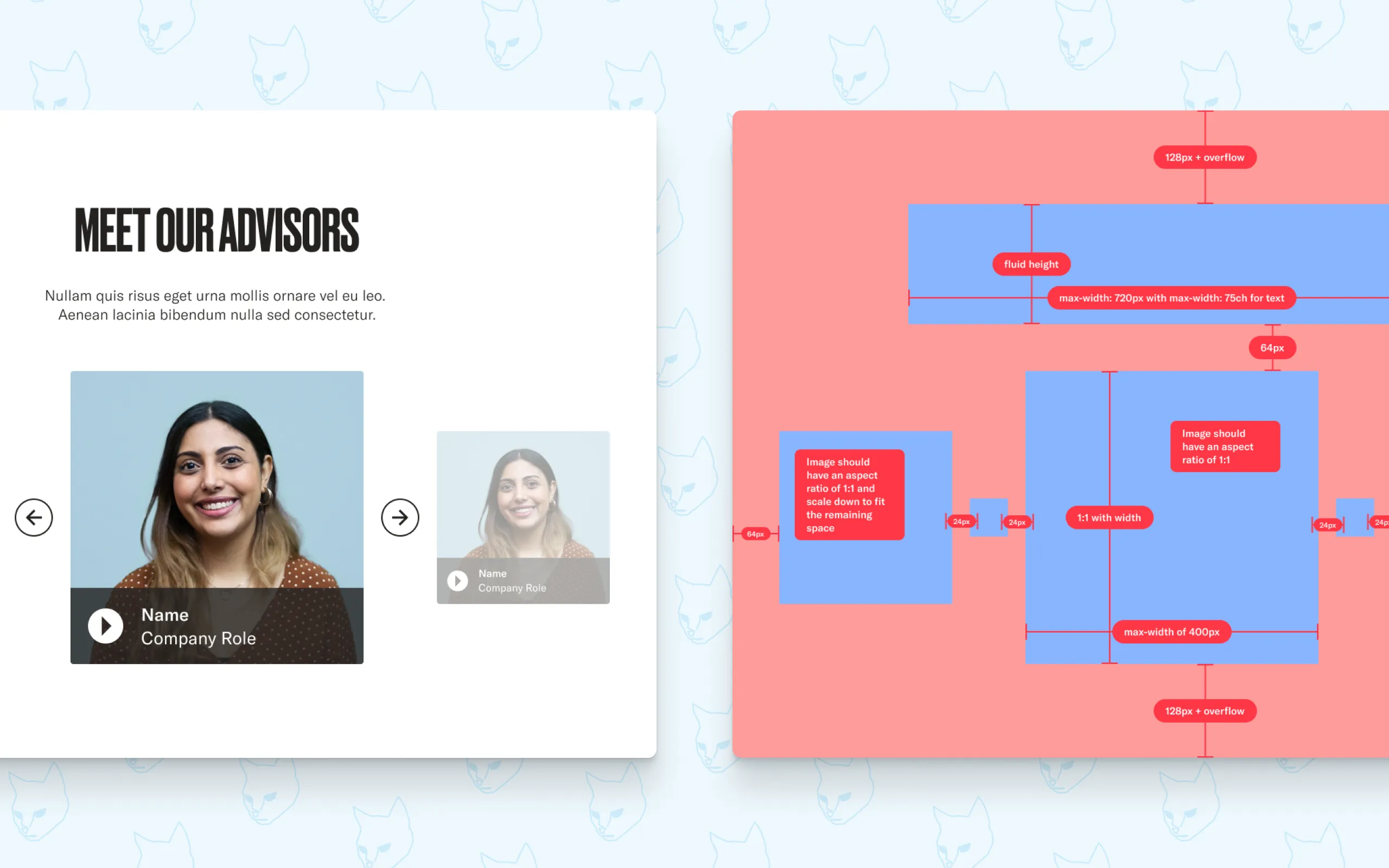
Each component was documented with full specifications. Every state, every property, every edge case laid out clearly for developers. This was a deliberate choice. Not all designers think about focus states or disabled states or error handling. By making them visible and documented, the system pushed both sides toward better habits.
The library grew from small atoms up to sections and full page templates, each layer building on the last, all the way back to those first foundational primitives.
Closing thoughts
The design system was built in parallel with ongoing design work over seven months. No dedicated sprint, no paused roadmap. Just a steady, considered build alongside everything else.
The reception from the Majority team was really great. Designers and developers finally had a common way of communicating, giving more time for actual design exploration and getting from first discussion to finished component faster, and perhaps more importantly, with a lot less frustration.
A design system is never really finished. But getting the foundation right means everything that comes after is faster, more consistent, and a lot less painful for everyone involved.